


Remember college years when the first day of class meant digging deep into the credit cards to purchase the required reading for each course? We easily dropped $400-500 just to cover one semester’s classes. Well, for an artist, this thirst for knowledge doesn’t end with the cap and gown ritual. Like building a home, Design Theory is the foundation of our studies and key to evolving our sensibilities as our careers grow.
From Menagerie’s vast library, we offer you our Top 10 Design theory books collected from teacher recommendations and Cheryl’s monthly retreats to the neighborhood bookstore.
Enjoy!
1) The Graphic Design Reader by Steven Heller
2) Logo Design Workbook by Noreen Morioka
3) Universal Principles of Design by William Lidwell
4) Making and Breaking the Grid by Timothy Samara
5) Typography: Macro + Microaesthetics by Willi Kunz
6) Anatomy Lessons from the Great Masters by Terence Coyle
7) Dynamic Figure Drawing by Burne Hogarth
8) Great Production by Design by Constance J. Sidles
9) Creativity for Graphic Designers by Mark Oldach
10) Branding: From Brief to Finished Solution by Mono
Did we leave out a book you love? We want to hear from you!
If you want to see more reading recommendations, be sure to see our Top 10 Typography books.
Wednesday, July 28, 2010
Top 10 Design Theory Books for Artists
Thursday, July 15, 2010
Flashback to 1983

Boom box, Ray Bans, high tops, and giant clocks on gold chains...what do all these remind you of? That’s right (or should we say “Fer sure”), the ’80s.
As our file server was being attended to its annual maintenance, the Menagerie team flashbacked to 1983 – to the decade of The Police, Eurythmics, and when Michael Jackson’s “Thriller” was the top pop album of the year. The average income was a whopping $20,800 and the price of a gallon of gas was a measly $1.29. This was also the time when a graphic designer’s hands, dirty with graphite, cramped from hours of sketching and Apple was just a glint in the eyes of two “Steves” in Silicon Valley.
On this day, work (yes real work) still needed to be completed and designers were challenged with four current projects: A Self Promotion Photo Essay, Title Treatments, Type Speccing, and a Color Marker Comp for a Consumer Ad. Just one restriction…use only tools available in 1983 (Cheryl’s Grad year).

Assignment 1 – Typographic Photo Essay. The first project was to create a typographic photo essay spelling out “Menagerie” using a disposable camera. 27 shots. No preview. No multiple exposures. Instead of searching iStock or browsing the digital photo archive, designers had to be resourceful with their surroundings, objects found around the building and even themselves as props. They soon realized that the instant gratification of digital cameras and an unlimited Flash card space was a huge advantage in the modern design process. For this project, they had to wait a couple of days before their photos developed and if they caught the perfect shot.
Assignment 2 – Title Treatments. For this assignment, each artist designed a title treatment without the aid of an electronic font library, Veer or even Apple’s system fonts: Monaco, New York and Geneva. The only electronic device available was a copy machine with color copies at $10 and black and white copies at $1 each (in fake money of course). They were given reference books (only available in the ’80s), tracing paper, pencils, rulers and rapidograph pens. Also available were rub down lettering sheets ($10), which proved to be time savers for some. Designers could no longer scroll through the font library and click on whatever felt good. They spent serious consideration over their font choice before taking the time to sketch an entire title.
Assignment 3 – Speccing Type. This was by far the assignment that proved most challenging. Since the average age of the crew is 27, setting type without the aid of Quark, InDesign or even a keyboard seemed unheard of. They were given only a sheet of paper with typewritten copy and a Pica ruler then Cheryl guided them with the process of manually calculating how to fit the copy into a predesigned layout. What would have taken minutes on the computer, took designers hours to figure out. At $100 a pop (in 1983) each time instructions was given to the typesetter, they had to make sure that the measurements and proofreading marks indicated exactly what they wanted.
Assignment 4 – Color Marker Comp. With this assignment, designers conceptualized a 3D TV Color Print Ad. The materials and assets given to them were copy, a print of the TV, drawing materials, and of course the use of the copy machine. Usually the designers’ first instinct would have been to surf the web for images and use Photoshop to put a quick composition together. With this assignment they first needed a clear idea in their head, sketch the vision, then tighten up the sketch with the use of the markers to convey color and composition. It was exciting to see the raw energy which came out of each unique concept.
All in all, Flashback Friday proved to be a truly educational day for the Creative team who began their design career in the age of technology. They realized that a workday without computers and other distractions (Facebook; chats - yes even cell phones were restricted for the day) was liberating and helped them think smarter and more efficiently.
In an age where anyone who knows how to use Photoshop considers themselves an artist, this day brought out the core creativity inside a true graphic designer.
So next time the server goes down or your Mac crashes “don’t have a cow, man”. You’ll never know, a “gnarly” idea might just come out of the other side of your brain.
All photos in this post were taken by a disposable camera.
Article written by Nancy Sanchez
Tuesday, July 13, 2010
A Global Menagination – Part 2
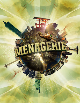
The Birth of a Planet
Now that the type is complete, we can start working on the planet.
Step 1: Select a texture from a rock, or experiment with different textures to see which works best for the planet.
Step 2: Create a new document, use the elliptical marquee tool, hold the SHIFT key and drag your mouse in order to make a perfect circle. Now, fill the circle with a solid color LAYER>NEW FILL LAYER>SOLID COLOR.
Step 3: Open the rock texture document in Photoshop and drag the image onto your circle document. Group the rock texture as a clipping group to the circle by clicking in between layers while holding down OPTION.

Step 4: Right click on the circle to bring up its selection. With your texture layer selected, apply the spherize filter (FILTER>DISTORT>SPHERIZE) on the rock texture. Next, add a curves adjustment layer (LAYER>NEW ADJUSTMENT LAYER>CURVES) above the texture layer to adjust contrast to surface texture as needed.


Step 5: Right click on the circle layer to bring up its selection. Fill a new layer with black and deselect the layer. Apply a gaussian blur filter to the layer to get a soft edge for the planet’s shadow. Clip the image to the circle layer to get rid of the excess areas of the shadow. Now change the layer mode from normal to multiply and lower the opacity to 85%. Feather the edge to make the transition of the shadow believable.


Step 6: Give the planet a little bit of color by adding a gradient map adjustment layer (LAYER>NEW ADJUSTMENT LAYER>GRADIENT MAP) above the rest of the other layers. Select a color for your planet and change the layer mode from normal to hue.

Step 7: We will now add bodies of water to make the planet look more believable. On a new layer, select a dark blue color and use a hard-edged brush to brush in some areas to represent the ocean. Reference other images of planets for help as needed.

Step 8: In order to create a sense of depth to the water, apply an inner glow to the blue ocean layer.

Step 9: Create a bursting effect from the planet. First, create a new layer and use a dark color to draw in some cracks in the planet. Then, switch the layer mode to overlay.
Step 10: After the cracks are drawn in, right click on the layer to bring up its selection. Create a new layer above the cracks layer and apply a lighter color to airbrush in. Now, deselect the the layer and apply a gaussian blur to the glow.
Step 11: Create some rays that are bursting out of the planet. This is a fairly simple trick that can be useful in creating some really effective rays. Start by creating a new document (8.5 x 11"). Press "D" on your keyboard to bring your color palettes to default black and white. Use the gradient tool and drag from top to bottom on your document to get the following image.
Step 12: Go to FILTERS>DISTORT>WAVE. Try to get a variation of thick and thin lines by experimenting with the different sliders. Click “OK”.


Step 13: Go back to FILTER>DISTORT>POLAR COORDINATES. Make sure "rectangular to polar" is selected and click “OK”. Invert (apple + I) the image and drag it onto the planet document.

Step 14: Now that the rays are done change the layer mode to color dodge and apply a gaussian blur to the rays layer.

Step 15: Apply a layer mask to the rays layers and mask out the areas of the ray that wouldn't shine through the planet.

Step 16: Now, the rays need a little variation. Add a new layer and use your gradient tool (set to radial), use the foreground to transparent setting and start adding a little bit of glows in different areas of the cracks.

Step 17: Add some night lights to the planet. Search for "earth lights at night" for reference. After you find a nice image for reference. Bring the image to the planet document and set the layer mode to color dodge.


Step 18: Mask out the areas of the image to fit onto the land areas of the planet.
Below are the links to PART ONE and THREE of the TUTORIAL
A Global Menagination - PART ONE
A Global Menaagination - PART THREE