


Nearly a year ago, good friend, mentor and author Peleg Top invited me to judge entries for his latest book entitled Logolicious – a pocket-sized treasure packed with today's most visually delicious logos. It was my honor to be part of the prestigious jury which edited and shaped the book. Each selected work captures a unique concept, stunning typography and a perfect balance of graphic design's formal elements. These logos personify a brand, promise a message and persuade an audience and I'm excited to announce you can now see the collected work first hand. The book is now available online and in bookstores everywhere.
So dig in and enjoy “a tasty collection of the best logos from around the globe.” Then, discover 9 more compact resources every designer should carry in their pocket.
1. 365 AIGA Year in Design 26 – AIGA
2. 1000 Stencils – Guido Indij
3. ABC 3D – Marion Bataille
4. Caffeine for the Creative Mind – Mumaw Oldfield
5. Creative Sparks – Jim Krause
6. ideaSPOTTING – Sam Harrison
7. idea index – Jim Krause
8. It’s Not How Good You Are, It’s How Good You Want to Be – Phaidon
9. Strengths Finder 2.0 – Tom Rath
Wednesday, December 1, 2010
A Recipe for the Best in Worldwide Logo Design!
Thursday, October 7, 2010
Roll Out the Red Carpet! The Leading Ladies and Men are Here!

Imagine yourself surrounded by America’s most glamorous film stars of The Golden Years of Hollywood. From the seductive presence of Marilyn Monroe and Elizabeth Taylor to the daring bravery of Clark Gable and Cary Grant, you can relive 30 legendary performances in 2 must-have DVD sets – Leading Ladies and Leading Men Collections. And, we’re thrilled to invite you behind the scenes on the making of its package.
This DVD collection was a unique design challenge due to the number of films and performers included. The marketing direction stressed to visually represent each of the 15 movies and every actor on the package’s exterior. Usually that kind of strategy requires typical, and often overused, graphic grid technique. Instead, we imagined a completely different approach – a photo shoot.
Simple right? Flash back 50 years in our Delorean time machine and set up a live photo shoot. Wow – Monroe, Newman, Hepburn, Presley, Welch , Fonda – all in the same room! What stories we would have. As amazing as that would be, we flash back to reality and find designers sifting through hundreds of black & white stills of our beloved actors in their most memorable roles. After searching for the highest quality full body poses and exploring various perspectives, we discovered just the right combination – and voila! Quiet on the set. Actors in their position. The package is born.
October 5, 2010 marked the date these collections hit stores & online retailers. It’s a thrill to share that both collections were sold out on Amazon.com on that very same day.
Now, audiences of all generations can experience the memorable and moving performances of Hollywood’s Golden Years. And Menagerie Creative is excited to have put you right in the middle of the action!
Monday, September 27, 2010
Top 10 Flight Tips for a Portfolio that Soars! #08

08: TAKE A DETOUR
If you feel your work is lacking breadth or isn’t as consistently strong as you know it can be, create a series of self-initiated pieces that demonstrate your conceptual and technical prowess. One way to accomplishing this is take a show stopping project you’ve already created and build an entire campaign around it. Another suggestion is to take one of your personal hobbies or interests and imagine an entirely new product line – packaging, advertising, social media, online games – let your imagination run free. Show your audience you are masterfully creative and a seriously well-rounded thinker.
Tuesday, August 31, 2010
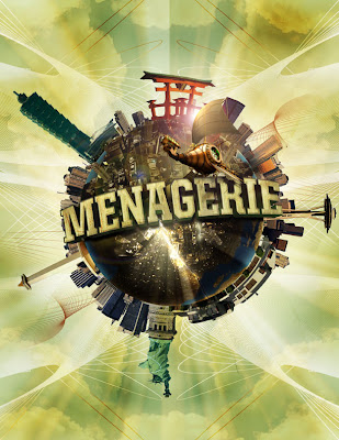
A Global Menagination – Part 3

Polar Panorama Effect
This last part of the tutorial is working with panoramic photos and using Photoshop’s “Polar Coordinates” filter to create a circular image to wrap around the planet. First, there are a few things to keep in mind when you create your panoramic shot:
• Panoramas cropped to have an aspect ratio of at least 2:1 (the width should be at least two times the height) work best. Wider photos are better.
• The bottom area of your photo should have very little detail (ie. sand, asphalt, or water). This area will
become the center of your planet and will be distorted the most.
• The upper area of your photo should also be light on detail— preferably just one color (ie. blue sky, night sky, etc.).
• The left and right edges of your photo should match or come close to matching each other.
• Since the left and right edges of your photo will be joined, the horizon must be exactly horizontal. If they
are at different heights your planet will have a big crack on the surface.
Step 1: In a new Photoshop document, prepare your image for the polar filter. Follow the guidelines above and incorporate the buildings you would like to stand out in the image.

Step 2: Once you have your buildings laid together, stretch the image so that it becomes a perfect square. Flatten your image, then go to Select Image>Image Size. Uncheck "constrain proportions" and set the height to the same value as your width. Next Rotate the image 180 degrees. (Image>Rotate Canvas>180)
You should have something similar to the image below.

Step 3: Apply the Polar Filter to wrap the image into a sphere. Choose Filter>Distort>Polar Cordinates and in the resulting dialog box, select the "Rectangular to Polar" setting. You should have something like the following...

Step 4: The rest is a just a little digital retouching. Rotate your planet to your liking, adjust the contrast and colors, clean up your edges where the left and right borders come together. (The clone stamp and healing brush is very handy here). We can now import the flattened image into the previous combined tutorial file. The tutorial file is a combination of the final files from the typographic and planet tutorials.
Step 5: Now that you have brought in your panoramic buildings. Create a layer mask so that all your buildings are the only elements left showing on the layer. Add a “brightness/contrast adjustments” layer so that you can enhance and improve your image’s quality.

Your planet should start to look complete.

Step 6: Add some more buildings on top of the planet to give it more details near the continents. Google Earth is a great way to find the perfect angle for your cities since it offers the versatility to move and rotate your camera angle as you please. You want something that offers a bird’s-eye view at a skew. Mask out an edge of the city so that you can have some variation of buildings protruding up from the mask.


Before we import the image, desaturate (IMAGE>ADJUSTMENTS>HUE/SATURATION) the colors so that your city is black and white. It will be easier to apply color effects once you have your city laid out on the planet.
Step 7: Drop your city into your image and use the warp tool (EDIT>TRANSFORM>WARP) to adjust the edges so that it looks like it conforms around the sphere.

Repeat Step 6 & 7 for the other side of your city and you should have something like the image below.

Step 8: Next, it is time to give the buildings some color. In your layers palette, add a gradient map on top of your buildings), and change the layer mode to "Color Dodge". Choose a color for the highlighted color as well as a dark for your shadows.


Step 9: Now we need to bring a little more contrast to the cities. Add a "Curves” layer on top of your “buildings” layer and adjust your curves so that you have a better balance of blacks and whites on your buildings.


Step 10: Now you are all set. Use varying opacities and brush sizes to bring out specific highlights or to burn darker shades in some areas. Brush some colors and experiment with the different layer modes to see what effect gives your planet the best results you are looking for!
Below are the links to PART ONE and TWO of the TUTORIAL
A Global Menagination - PART ONE
A Global Menaagination - PART TWO
Tuesday, August 24, 2010
Top 10 Inspirational Books for Designers

As creative artists, we are often asked where inspiration comes from. Everywhere right? Every image, word, emotion, moment can capture our imagination. In this world of fast food, video streaming and mobile networking we often forget our creative spirit can often be inspired from good old-fashioned books. Whether hard bound, paper back, novels, mysteries, tutorials, anthologies, picture books, comics or even school textbooks these treasures of pulp and ink put our creative minds to work. Books expose us to colorfully imaginative worlds, to the sensations of being young and carefree, to bold ideas – new or even long forgotten.
Next time you are faced with a creative block, pick up a book you loved as a kid or one completely unrelated to design and submerge yourself into the ocean of words.
Enjoy the adventure!
1) Tuesdays with Morrie
2) The Five People You Meet in Heaven
3) Whatever You Think, Think the Opposite
4) The Last Lecture
5) Things I Have Learned
6) Simply Material
7) The Marvel Art of Marko Djurdjevic
8) D'artiste: Concept Art
9) D'artiste: Digital Painting
10) Taschen's Paris: Hotels, Restaurants & Shops
Wednesday, July 28, 2010
Top 10 Design Theory Books for Artists

Remember college years when the first day of class meant digging deep into the credit cards to purchase the required reading for each course? We easily dropped $400-500 just to cover one semester’s classes. Well, for an artist, this thirst for knowledge doesn’t end with the cap and gown ritual. Like building a home, Design Theory is the foundation of our studies and key to evolving our sensibilities as our careers grow.
From Menagerie’s vast library, we offer you our Top 10 Design theory books collected from teacher recommendations and Cheryl’s monthly retreats to the neighborhood bookstore.
Enjoy!
1) The Graphic Design Reader by Steven Heller
2) Logo Design Workbook by Noreen Morioka
3) Universal Principles of Design by William Lidwell
4) Making and Breaking the Grid by Timothy Samara
5) Typography: Macro + Microaesthetics by Willi Kunz
6) Anatomy Lessons from the Great Masters by Terence Coyle
7) Dynamic Figure Drawing by Burne Hogarth
8) Great Production by Design by Constance J. Sidles
9) Creativity for Graphic Designers by Mark Oldach
10) Branding: From Brief to Finished Solution by Mono
Did we leave out a book you love? We want to hear from you!
If you want to see more reading recommendations, be sure to see our Top 10 Typography books.
Tuesday, July 13, 2010
A Global Menagination – Part 2
The Birth of a Planet
Now that the type is complete, we can start working on the planet.
Step 1: Select a texture from a rock, or experiment with different textures to see which works best for the planet.
Step 2: Create a new document, use the elliptical marquee tool, hold the SHIFT key and drag your mouse in order to make a perfect circle. Now, fill the circle with a solid color LAYER>NEW FILL LAYER>SOLID COLOR.
Step 3: Open the rock texture document in Photoshop and drag the image onto your circle document. Group the rock texture as a clipping group to the circle by clicking in between layers while holding down OPTION.

Step 4: Right click on the circle to bring up its selection. With your texture layer selected, apply the spherize filter (FILTER>DISTORT>SPHERIZE) on the rock texture. Next, add a curves adjustment layer (LAYER>NEW ADJUSTMENT LAYER>CURVES) above the texture layer to adjust contrast to surface texture as needed.


Step 5: Right click on the circle layer to bring up its selection. Fill a new layer with black and deselect the layer. Apply a gaussian blur filter to the layer to get a soft edge for the planet’s shadow. Clip the image to the circle layer to get rid of the excess areas of the shadow. Now change the layer mode from normal to multiply and lower the opacity to 85%. Feather the edge to make the transition of the shadow believable.


Step 6: Give the planet a little bit of color by adding a gradient map adjustment layer (LAYER>NEW ADJUSTMENT LAYER>GRADIENT MAP) above the rest of the other layers. Select a color for your planet and change the layer mode from normal to hue.

Step 7: We will now add bodies of water to make the planet look more believable. On a new layer, select a dark blue color and use a hard-edged brush to brush in some areas to represent the ocean. Reference other images of planets for help as needed.

Step 8: In order to create a sense of depth to the water, apply an inner glow to the blue ocean layer.

Step 9: Create a bursting effect from the planet. First, create a new layer and use a dark color to draw in some cracks in the planet. Then, switch the layer mode to overlay.
Step 10: After the cracks are drawn in, right click on the layer to bring up its selection. Create a new layer above the cracks layer and apply a lighter color to airbrush in. Now, deselect the the layer and apply a gaussian blur to the glow.
Step 11: Create some rays that are bursting out of the planet. This is a fairly simple trick that can be useful in creating some really effective rays. Start by creating a new document (8.5 x 11"). Press "D" on your keyboard to bring your color palettes to default black and white. Use the gradient tool and drag from top to bottom on your document to get the following image.
Step 12: Go to FILTERS>DISTORT>WAVE. Try to get a variation of thick and thin lines by experimenting with the different sliders. Click “OK”.


Step 13: Go back to FILTER>DISTORT>POLAR COORDINATES. Make sure "rectangular to polar" is selected and click “OK”. Invert (apple + I) the image and drag it onto the planet document.

Step 14: Now that the rays are done change the layer mode to color dodge and apply a gaussian blur to the rays layer.

Step 15: Apply a layer mask to the rays layers and mask out the areas of the ray that wouldn't shine through the planet.

Step 16: Now, the rays need a little variation. Add a new layer and use your gradient tool (set to radial), use the foreground to transparent setting and start adding a little bit of glows in different areas of the cracks.

Step 17: Add some night lights to the planet. Search for "earth lights at night" for reference. After you find a nice image for reference. Bring the image to the planet document and set the layer mode to color dodge.


Step 18: Mask out the areas of the image to fit onto the land areas of the planet.
Below are the links to PART ONE and THREE of the TUTORIAL
A Global Menagination - PART ONE
A Global Menaagination - PART THREE