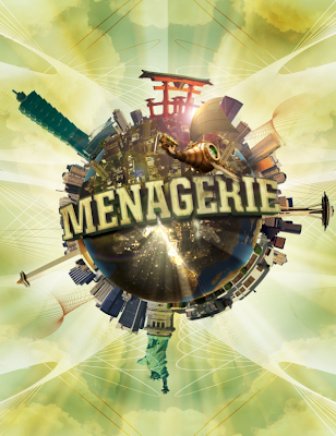
Polar Panorama Effect
This last part of the tutorial is working with panoramic photos and using Photoshop’s “Polar Coordinates” filter to create a circular image to wrap around the planet. First, there are a few things to keep in mind when you create your panoramic shot:
• Panoramas cropped to have an aspect ratio of at least 2:1 (the width should be at least two times the height) work best. Wider photos are better.
• The bottom area of your photo should have very little detail (ie. sand, asphalt, or water). This area will
become the center of your planet and will be distorted the most.
• The upper area of your photo should also be light on detail— preferably just one color (ie. blue sky, night sky, etc.).
• The left and right edges of your photo should match or come close to matching each other.
• Since the left and right edges of your photo will be joined, the horizon must be exactly horizontal. If they
are at different heights your planet will have a big crack on the surface.
Step 1: In a new Photoshop document, prepare your image for the polar filter. Follow the guidelines above and incorporate the buildings you would like to stand out in the image.

Step 2: Once you have your buildings laid together, stretch the image so that it becomes a perfect square. Flatten your image, then go to Select Image>Image Size. Uncheck "constrain proportions" and set the height to the same value as your width. Next Rotate the image 180 degrees. (Image>Rotate Canvas>180)
You should have something similar to the image below.
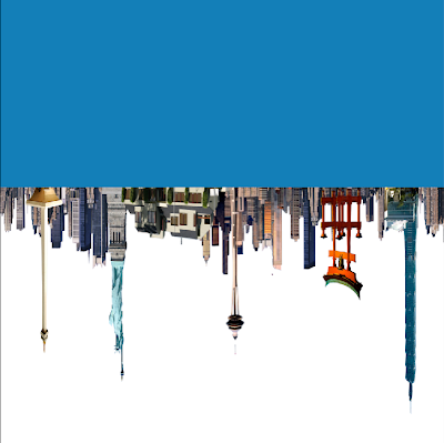
Step 3: Apply the Polar Filter to wrap the image into a sphere. Choose Filter>Distort>Polar Cordinates and in the resulting dialog box, select the "Rectangular to Polar" setting. You should have something like the following...
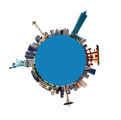
Step 4: The rest is a just a little digital retouching. Rotate your planet to your liking, adjust the contrast and colors, clean up your edges where the left and right borders come together. (The clone stamp and healing brush is very handy here). We can now import the flattened image into the previous combined tutorial file. The tutorial file is a combination of the final files from the typographic and planet tutorials.
Step 5: Now that you have brought in your panoramic buildings. Create a layer mask so that all your buildings are the only elements left showing on the layer. Add a “brightness/contrast adjustments” layer so that you can enhance and improve your image’s quality.
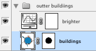
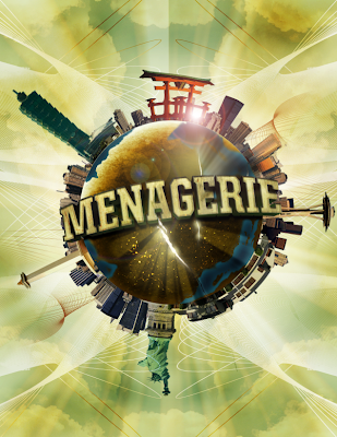
Your planet should start to look complete.
Step 6: Add some more buildings on top of the planet to give it more details near the continents. Google Earth is a great way to find the perfect angle for your cities since it offers the versatility to move and rotate your camera angle as you please. You want something that offers a bird’s-eye view at a skew. Mask out an edge of the city so that you can have some variation of buildings protruding up from the mask.
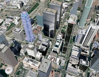
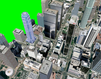
Before we import the image, desaturate (IMAGE>ADJUSTMENTS>HUE/SATURATION) the colors so that your city is black and white. It will be easier to apply color effects once you have your city laid out on the planet.
Step 7: Drop your city into your image and use the warp tool (EDIT>TRANSFORM>WARP) to adjust the edges so that it looks like it conforms around the sphere.
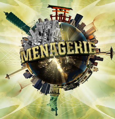
Repeat Step 6 & 7 for the other side of your city and you should have something like the image below.
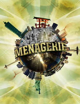
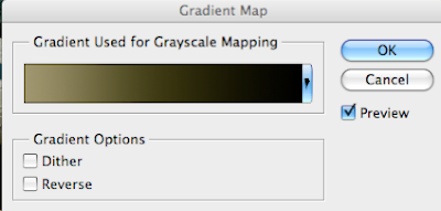
Step 8: Next, it is time to give the buildings some color. In your layers palette, add a gradient map on top of your buildings), and change the layer mode to "Color Dodge". Choose a color for the highlighted color as well as a dark for your shadows.
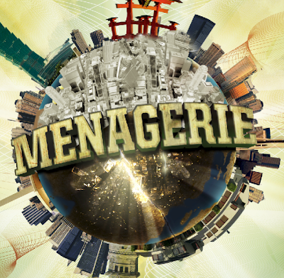
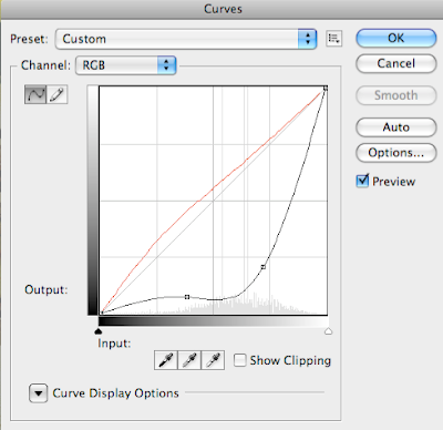
Step 9: Now we need to bring a little more contrast to the cities. Add a "Curves” layer on top of your “buildings” layer and adjust your curves so that you have a better balance of blacks and whites on your buildings.
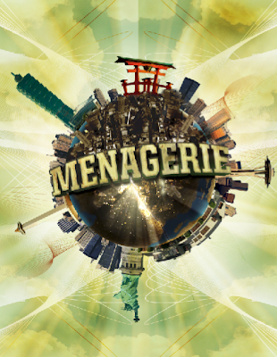
Step 10: Now you are all set. Use varying opacities and brush sizes to bring out specific highlights or to burn darker shades in some areas. Brush some colors and experiment with the different layer modes to see what effect gives your planet the best results you are looking for!

Below are the links to PART ONE and TWO of the TUTORIAL
A Global Menagination - PART ONE
A Global Menaagination - PART TWO


0 comments:
Post a Comment